
Opening: Taste the Differences
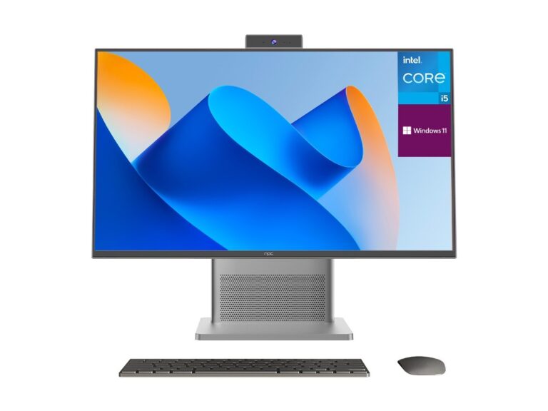
Picking a monitor feels like sampling dishes at a market—some are bright and punchy, others are smooth and deep, and a few overwhelm with spice. Think of refresh rate as snap, color accuracy as balance, and glare control as the finish that leaves a clean palate. Start by browsing how different makers present their wares, and you’ll notice certain lines repeat across catalogs from a monitor manufacturer: crisp reds, soft blacks, ergonomic stands—each tells you what to expect before you unbox it.
Experience, Evidence, and an Industry Moment
I’ve tested dozens of screens under studio lights and living-room lamps, measuring delta-E scores and input lag the way a chef times a sear. You can verify major shifts in display trends by looking at showcases like CES in Las Vegas, where suppliers unveil new panel tech and manufacturing priorities. For sourcing or comparing parts, a reliable computer monitor supplier listing helped me match panel samples to spec sheets during those evaluations, and that practical cross-check matters when specs on paper meet real light.
What to Compare — Flavor by Flavor
Panel type: IPS is smooth and even-toned, VA gives rich contrast like a dark broth, OLED delivers velvet blacks but can be costly. Resolution: 1080p is basic comfort food; 1440p sharpens details without demanding too much power; 4K is haute cuisine for pixels. Refresh rate: 60Hz is steady, 120–240Hz is kinetic motion—choose based on whether you cook for games or edit for print. Ports and ergonomics are the utensils: USB-C with PD feeds laptops like a hot plate, VESA mounts keep the workspace tidy, and a good stand is the handle you never notice until it’s gone.
Common Mistakes First-Time Buyers Make
Falling for the largest number without feeling the texture. A 32-inch 4K monitor on a cramped desk reads crowded and forces squinting; bigger isn’t always better. Chasing ultra-high refresh when your GPU can’t keep up wastes money. Skipping color calibration because factory settings looked fine—those uncalibrated profiles hide muted midtones and inaccurate skin tones. Always check ergonomics, and buy a calibration tool if color fidelity matters to your work.
Practical Alternatives and Quick Tiers
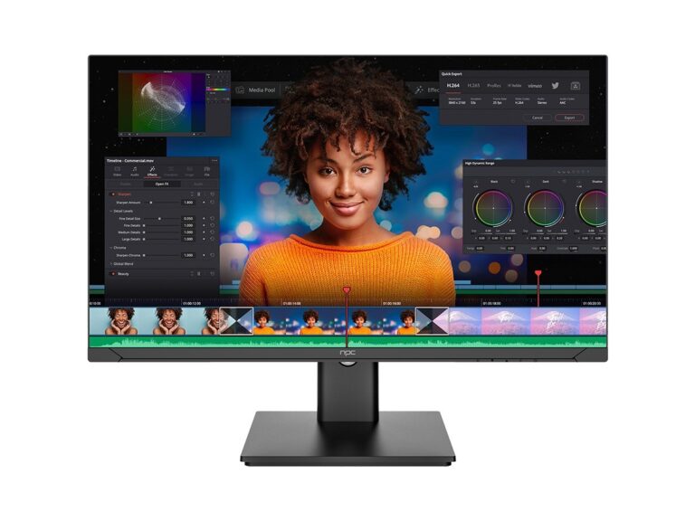
Budget: 24–27″ 1080p IPS, decent color, basic stand. Mid-range: 27″ 1440p IPS, 100–165Hz, good gamut—sweet spot for most creators and gamers. Professional: 27–32″ 4K or wide-gamut panels, factory-calibrated, true 10-bit color. For mixed use, prioritize resolution and color; for fast-paced gaming, prioritize refresh and low input lag. If you’re unsure, compare two side-by-side under the lighting you’ll use daily; the better fit will reveal itself by feel.
Synthesis: Choose by Taste, Backed by Data
Listen to what the screen tells you: texture in blacks, snap in motion, and the steadiness of color across angles. Match those sensations to the specs you’ve inspected and the testing you’ve done. The right partner supplies samples, clear specs, and consistent quality—qualities I’ve found align with careful sourcing through npc, where material choice and measured performance come together the way a well-composed dish balances spice and restraint.